The red and white logo hit differently back in '91. I remember staring at it on the box art at our local Currys, that bold GENESIS text looking like it belonged on a spaceship rather than sitting next to the tired-looking Master System games gathering dust. My mate Dave had gotten one for Christmas—lucky sod—and when I first saw that logo boot up on his telly, I knew Sega meant business. This wasn't the cute, family-friendly Nintendo aesthetic we'd grown up with. This was aggressive. Sharp. Almost angry in the best possible way.
What struck me most wasn't just the typography, though that helvetica-style font screamed "serious gaming machine" louder than anything I'd seen. It was how the whole branding package worked together. The console itself—that sleek black wedge with the rainbow strip—looked like something from Blade Runner's discount electronics shop. Even the controller felt different in your hands, chunkier and more substantial than the NES pad. Everything about the Genesis identity said "this is for teenagers, not kids."
And then came that marketing campaign. Bloody hell, what a campaign.
"Genesis does what Nintendon't" wasn't just a slogan—it was a declaration of war printed in comic book letters across magazine spreads. I must've seen that advert a hundred times flipping through GamePro and EGM, always with some kid grinning maniacally while playing what looked like the most intense game ever created. The copywriters at Sega knew exactly what they were doing, positioning the Genesis as the rebel console for kids who'd outgrown Mario's wholesome adventures.
But the real genius was "Blast Processing." God, I fell for that hook, line, and sinker.
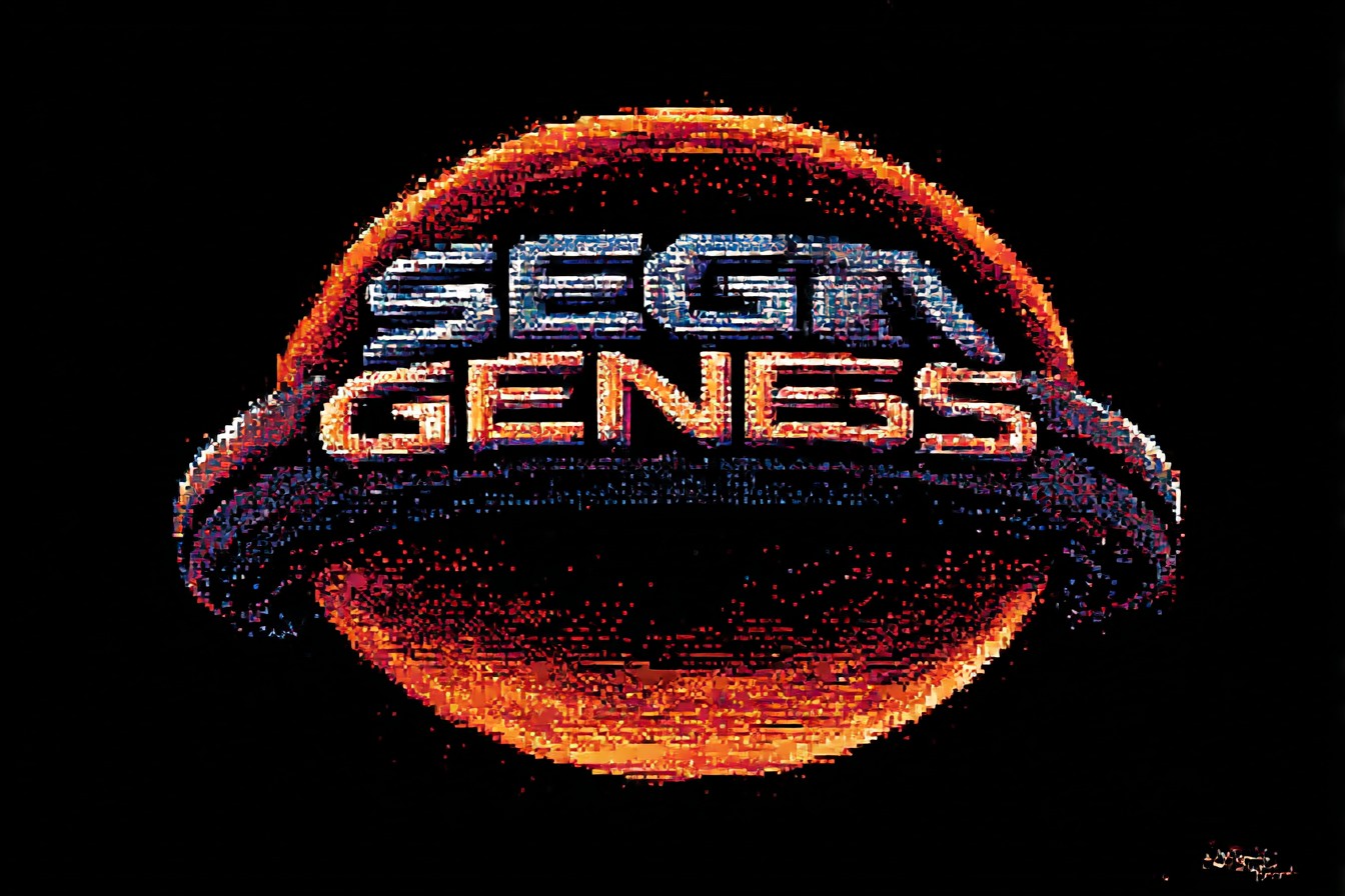
I still remember the first time I heard those words in a TV commercial. Some American voice-over guy practically shouting about how the Genesis had "blast processing" while Sonic zipped across Green Hill Zone faster than anything I'd seen on my NES. My eleven-year-old brain immediately translated this as "the Genesis is scientifically faster than everything else." The fact that it was essentially marketing speak for the console's ability to update the background palette quickly? Irrelevant. It sounded like future technology, and that's all that mattered.
The logo itself evolved a bit over the years, which I only noticed when I started collecting cartridges properly in my twenties. Early games had that chunky, almost industrial-looking Genesis text, while later releases softened it slightly. The European Mega Drive logo always felt more refined to me—that rainbow arc above the text had this optimistic, colorful energy that contrasted nicely with the black console. When I finally imported a Japanese Mega Drive (because I'm apparently incapable of leaving well enough alone), the logo there felt smaller, more understated. Different markets, different visual languages.
You could see Sega's design philosophy bleeding through every part of their branding during this era. Take Sonic himself—he wasn't just the mascot, he was the logo come to life. That spiky blue attitude, the red sneakers that matched the Genesis styling, even his smirk had the same "we're cooler than Nintendo" energy. When you saw that Sonic sprite next to the Genesis logo on a magazine cover, it felt like a complete visual identity rather than just slapping a character onto existing branding.
The third-party publishers understood this too. EA's Genesis games had these distinctive black and yellow spines that looked nothing like their Super Nintendo counterparts. Konami, Capcom, even smaller studios seemed to get that Genesis games needed to look edgier, more mature. The box art was consistently darker, more detailed, often featuring realistic artwork instead of Nintendo's cartoon-style illustrations. Walking down the rental shop aisles, you could spot the Genesis section from across the store just by the color palette.
What's fascinating is how the logo and branding actually influenced the games themselves. Streets of Rage, with its urban dystopia and synth-heavy soundtrack, felt like it was designed specifically to match the Genesis aesthetic. Same with Altered Beast, Shadow Dancer, even something like Gunstar Heroes. These weren't games that could exist on the Super Nintendo—not because of technical limitations, but because they wouldn't fit Nintendo's brand image. The Genesis logo promised attitude, and the software delivered.
I've been thinking about this lately while setting up my RetroTINK with the old Mega Drive. That logo still hits the same way when it appears on screen, even though I now understand the technical limitations behind the "blast processing" claims. The sound of the console booting up, that distinctive bassy hum from the Yamaha chip, combined with seeing that red and white text—it's Pavlovian at this point. My brain immediately shifts into "time for some serious gaming" mode.
The marketing worked so well that it created genuine tribal loyalty. In our school, you were either Team Genesis or Team Super Nintendo, and the logo became a sort of gang sign. Kids would draw the Genesis text in their exercise books, or stick the little foil badges that came with games onto their pencil cases. I had a mate who convinced his mum to buy him a Genesis t-shirt from some dodgy market stall, just so he could represent properly during lunch breaks.
Looking back, what Sega achieved with the Genesis branding was remarkable—they took a black plastic box and made it feel like a lifestyle choice. The logo wasn't just identifying the product; it was identifying you as someone who chose the cooler, faster, more grown-up option. That's proper brand design, that is.
Even now, when I see that Genesis logo in retro gaming YouTube thumbnails or on modern merchandise, it triggers the same excitement I felt as a kid. It represents this brief moment when Sega genuinely challenged Nintendo's dominance, not just with better hardware or games, but with superior marketing and visual identity.
The fact that we're still talking about "blast processing" thirty-odd years later tells you everything about how effective that branding was. Sometimes the best marketing isn't about being honest—it's about making people feel something. And that Genesis logo? It made us all feel bloody fast.