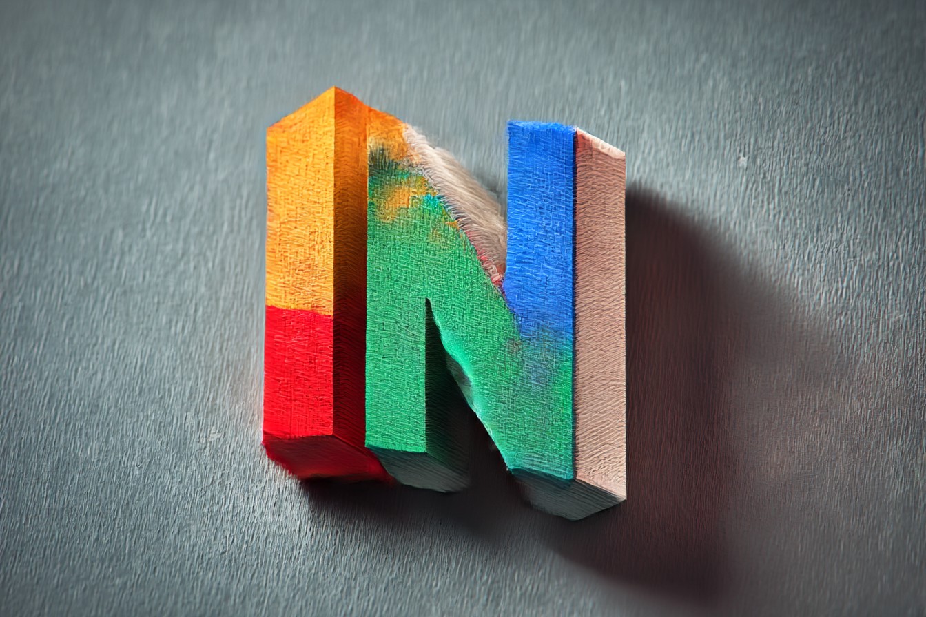
There's something about that chunky, dimensional "N64" that still makes me stop and stare when I spot it on a shelf or boot screen. You know the one—that three-dimensional block logo that sits there like a tiny piece of architecture, all beveled edges and mathematical precision. It's been nearly three decades since Nintendo unveiled it, and honestly? It looks more modern than half the flat, minimalist logos companies are churning out today.
I remember the exact moment I first saw it properly. Not in a magazine scan or blurry TV commercial, but right there on my mate Dave's brand new console in his bedroom, autumn of '96. His dad had managed to snag one from somewhere—probably knew someone who knew someone, the way these things worked back then. The logo just sat there on the startup screen, rotating slowly like it owned the place. Even as a teenager who thought he knew what "cool" looked like, I had to admit it was pretty bloody impressive.
What struck me then, and still does now, was how solid it felt. Not just visually, but almost tactually—like you could reach into the screen and pick it up. Those chamfered edges caught light in a way that made it feel real, weighty. Compare that to the flat Nintendo logo we'd grown up with, all red and white simplicity, and this was like watching someone build a monument out of pixels.
The genius of it wasn't just the 3D effect, though that was certainly part of the appeal. It was how perfectly it captured what the console was trying to be. This wasn't your little brother's Super Nintendo anymore—this was serious hardware for serious three-dimensional gaming. The logo didn't just represent the product; it embodied it. When you looked at that chunky, almost brutalist design, you immediately understood this machine was going to do things differently.
I've spent more time than I probably should have analyzing why it works so well. The proportions, for one thing, are absolutely spot-on. It's not trying too hard to be edgy or futuristic in that late-90s way where everything needed unnecessary spikes or chrome. Instead, it's got this quiet confidence—mathematical, precise, but somehow warm too. The way the "N" connects to the "64" creates this perfect visual balance that feels inevitable once you see it, but probably took someone ages to get right.
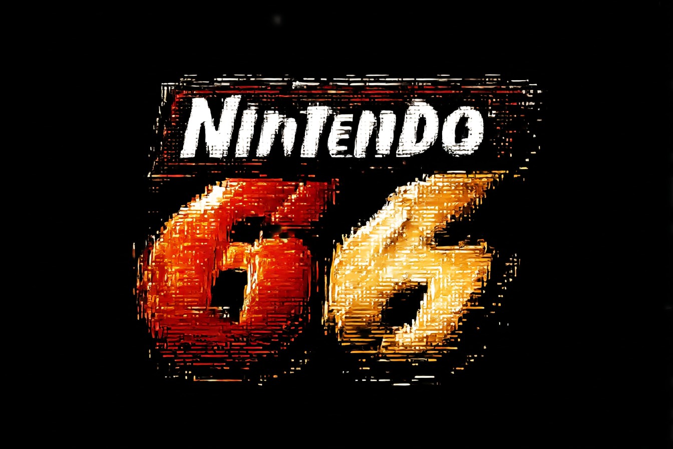
The color choices were brilliant too. That deep blue to lighter blue gradient wasn't just pretty—it reinforced the dimensional effect, making the whole thing pop off whatever background they stuck it on. I remember flicking through old GamePro magazines (yeah, I kept them, don't judge) and how the N64 logo always jumped out from the page layouts, even when it was tiny.
But here's the thing that really gets me: it's held up better than almost any other gaming logo from that era. The original PlayStation logo? Dated. The Sega Saturn rings? Feels very mid-90s now. Even the Dreamcast swirl, which I absolutely loved at the time, screams its vintage. But that N64 cube? Stick it on a piece of modern packaging and it wouldn't look out of place. If anything, it'd probably look more current than whatever minimalist sans-serif nonsense is trendy this week.
I think part of its staying power comes from how it sidesteps specific visual trends. It's not trying to be sleek like a sports car or angular like a stealth bomber—references that date logos faster than milk in July. Instead, it's almost architectural, and good architecture tends to age well. Frank Lloyd Wright's buildings don't look "retro," they just look timeless. Same principle applies here.
The technical execution matters too, and this is where my inner nerd starts showing. The way they handled the lighting and shadowing on that logo was proper craftsmanship. Remember, this was 1996—3D graphics weren't something you could just whip up in five minutes with modern software. Someone had to model every edge, calculate every highlight, make sure it looked convincing whether it was spinning on a TV screen or printed in a magazine. The fact that it worked equally well in both contexts shows serious attention to detail.
What really impresses me, looking back with adult eyes and a mortgage, is how it managed to be both playful and sophisticated. It's clearly a toy company's logo—there's nothing austere or corporate about it. But it's also substantial enough that you could imagine it on serious hardware, which the N64 absolutely was, despite what the purple controller wars might suggest.
I still fire up my old N64 fairly regularly, usually when I'm feeling nostalgic or want to show my kid what Mario 64 looked like before HD remasters smoothed out all the personality. And every single time, when that logo appears, I get a little thrill of recognition. It's like seeing an old friend who's aged incredibly well—familiar, but still impressive.
The logo also perfectly captured Nintendo's position in the market at the time. They weren't trying to out-cool Sega or out-tech Sony with some flashy design language. They were saying, "Look, we make solid, well-engineered things that last." And you know what? They were right. My N64 still works perfectly, the logo on its case still looks sharp, and both will probably outlive whatever's powering my smart TV.
These days, when I see modern gaming logos with their flat designs and careful brand guidelines, I sometimes wonder if we've lost something. Not that minimalism is bad—Apple's proven you can do amazing things with simplicity. But there was something special about logos that weren't afraid to take up space, to cast shadows, to exist as objects rather than just marks.
The N64 logo wasn't just branding—it was a statement of intent, a promise of three-dimensional worlds, and a perfect little piece of design that somehow predicted its own longevity. Nearly thirty years later, it still looks like the future. Just goes to show that sometimes, getting the fundamentals right matters more than chasing whatever's fashionable.